Branding
Self-initiated branding project for Sycomore, an architecture firm specialising in ecological, luxury homes immersed in nature.
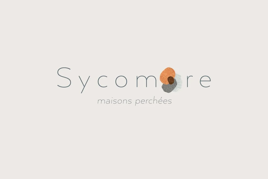
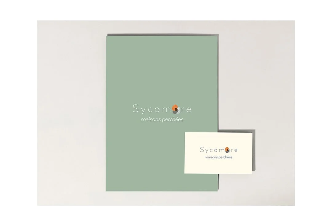
The visual identity draws inspiration from the sycamore tree’s seed pod — a symbol of nature, growth, and protection. The seed form became the conceptual foundation of the project, embodying both shelter and organic development.
I created the seed pod using textured crepe paper, introducing a tactile, handcrafted dimension to the identity. This element was carefully integrated into the Sycomore logotype, establishing a direct visual link between name and concept. A refined baseline was developed to anchor the composition and enhance clarity.
The colour palette balances warmth and precision. Ashy orange and soft brown evoke the intimate, protective interior of the pod, suggesting comfort and natural elegance. In contrast, anthracite and silver grey reference the architect’s pencil — expressing technical rigour, simplicity, and structural discipline.
The chosen typeface, Arquitecta, is an elegant and contemporary sans-serif with a humanist interpretation of 1920s geometric forms, reinforcing the dialogue between organic inspiration and architectural precision.